
Red call to action buttons do not in and of themselves increase conversions.
There isn't anything magical about red call-to-action buttons. Red CTA buttons only work to increase conversions if they are the only red item on the page.
I have seen quite a number of websites lately, a few of them belonging to members of this group, that are misusing this conversion rate optimization technique.

You want your call to action button to be a different color than anything else on the page. That could mean a green button or a yellow button or an orange button or even a black button.
The reason this technique works is because of something called Gestalt psychology. In the image below, what do you see first? You see the red Jelly Bean. It pops out and draws your eyes to it.
It's also worth mentioning that colors can be successfully employed in a wide variety of other techniques to help control user eye path


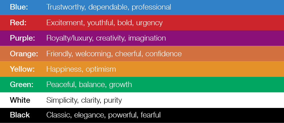
Colors are an important consideration with respect to conversions. Here's a chart that's similar to the one I first saw in my freshman year of college. What emotions are your web page colors evoking?

Robert Portillo is the founder of Nimbus Marketing. Nothing satisfies him more than expressing his thoughts well. He lives in Los Angeles with his wife and two sons. He can often be found at local farmer’s markets, hiking trails, and the beach.